

[fusion_builder_container hundred_percent=”no” equal_height_columns=”no” menu_anchor=”” hide_on_mobile=”small-visibility,medium-visibility,large-visibility” class=”” id=”” background_color=”” background_image=”” background_position=”center center” background_repeat=”no-repeat” fade=”no” background_parallax=”none” parallax_speed=”0.3″ video_mp4=”” video_webm=”” video_ogv=”” video_url=”” video_aspect_ratio=”16:9″ video_loop=”yes” video_mute=”yes” overlay_color=”” video_preview_image=”” border_size=”” border_color=”” border_style=”solid” padding_top=”” padding_bottom=”” padding_left=”” padding_right=””][fusion_builder_row][fusion_builder_column type=”1_1″ layout=”1_1″ background_position=”left top” background_color=”” border_size=”” border_color=”” border_style=”solid” border_position=”all” spacing=”yes” background_image=”” background_repeat=”no-repeat” padding_top=”” padding_right=”” padding_bottom=”” padding_left=”” margin_top=”0px” margin_bottom=”0px” class=”” id=”” animation_type=”” animation_speed=”0.3″ animation_direction=”left” hide_on_mobile=”small-visibility,medium-visibility,large-visibility” center_content=”no” last=”no” min_height=”” hover_type=”none” link=””][fusion_text]
In this article, you will learn how to notify users based on particular actions or events using Snackbar, Alert Dialog, Custom Alert Dialog, and Custom Progress Dialog using Kotlin.
Android Snackbar
Android Snackbar is a material design component introduced with API 22.2.0. The Snackbar is a view that mostly used to give quick feedback to the user, like Toast. We can say that the Snackbar is an advanced version of Android Toast. A toast is a view containing a quick short message for the user.
Snackbar can be dismissed by the user or an action listener or could be set up to respond to the users’ actions. Snackbar can perform an action like ‘Undo’ etc.,
When the Snackbar is showed, it is displayed at the bottom of the screen, with the default background color “#323232” and text color “#FFFFFF“.
Parameters of Snackbar
view: The view to find a parent from.
text: The text to show. Can be formatted text.
duration: How long to display the message. Either LENGTH_SHORT or LENGTH_LONG
Note: To use the Snackbar in your android application, you need to include the ‘com.google.android.material:material’ package in your build.gradle (app) dependencies.
build.gradle (:app)
android {
    compileSdkVersion 29
   ...
    }
}

dependencies {
    ...
    implementation 'com.google.android.material:material:1.0.0'
    ...
}
Snackbar vs Toast – Usage, and Difference
Difference between Snackbar and Toast
Snackbar:
- Snackbar was added in API Level 23.
- It can be shown inside the activity of the Applications.
- It can perform an action.
- It can be dismissed by swiping.
- It can handle user input.
- Useful for showing warnings/info messages to the user that needs attention.
Toast:
- Toast added in the API Level 1.
- Activity is not required (Can be shown on Android home or even above other apps).
- It can’t perform an action based on User input.
- It can’t be dismissed by swiping.
- It can’t handle user input like Swipe, Click, etc.
- Useful for showing info messages to the user.
The form you have selected does not exist.
The form you have selected does not exist.
Usage of Snackbar and Toast
Snackbar:
Snackbar used in the areas where a simple popup message needs to display along with an option to perform an action. For example, in the Gmail application, when you delete mail, quick Snackbar displays at the bottom with the message ‘1 Deleted’ with an action button ‘Undo.’ When pressing the ‘Undo’ action button, the deleted Mail will be restored.
Toast:
Toast is used in areas where system messages need to be displayed. For example, when your app tries to download images from a server but fails due to server timeout or no resource found, you need to display the error message saying that ‘Error Occurred.’
Now let’s create a
I have created a new project in android studio with empty activity and now I will show you an example of a Snackbar on image button click.
Let’s add the image button in our activity_main.xml.
<LinearLayout
        android:layout_width="wrap_content"
        android:layout_height="wrap_content"
        android:layout_gravity="center"
        android:layout_marginTop="25dp"
        android:gravity="center"
        android:orientation="horizontal">

        <TextView
            android:layout_width="wrap_content"
            android:layout_height="wrap_content"
            android:layout_marginEnd="25dp"
            android:text="Image Button ->" />

        <ImageButton
            android:id="@+id/image_button"
            android:layout_width="50dp"
            android:layout_height="50dp"
            android:contentDescription="image"
            android:src="@android:drawable/btn_star_big_on" />

    </LinearLayout>
Now I will explain how to show the Snackbar when the image button clicked. The click event is added in the onCreate method of MainActivity.kt.
/**
 * Handled the on click of ImageButton. And we have used SnackBar to notify.
 */

image_button.setOnClickListener { view ->
   Snackbar.make(view, "You have clicked image button.", Snackbar.LENGTH_LONG).show()
}
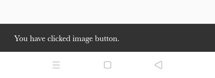
Output
When you click the image button, you will see the Snackbar text at the bottom of the screen.
Android Alert Dialog using Kotlin
Android AlertDialog is a subclass of Dialog that can display one, two or three buttons. AlertDialog is a window that pops up on the screen with some information asking for a user action.
The main core components that build an Alert Dialog:
- Title Text
- Message Description Text
- Buttons – There are three types of buttons: Positive, Negative, and Neutral
To create an AlertDialog we use the AlertDialog.Builder inner class.
val builder = AlertDialog.Builder(this)
You need to pass the context inside the constructor. Optionally, you can pass another parameter, the alert dialog style.
The form you have selected does not exist.
The form you have selected does not exist.
AlertDialog Methods which are used to build an AlertDialog
- setTitle
- setMessage
- setIcon
- setCustomTitle: Here, you can pass a custom view that will be put in place of the title part in the alert dialog.
- setPositiveButton: You can pass the string name, as well as button, clicked callback method here.
- setView: Used to add a custom view inside the alert dialog.
- setList: Used to set an array of strings that would display in the form of a list.
- setMultiChoiceList: You can set an array, but this time, you can select multiple items from the list thanks to the CheckBox.
- setPositiveButtonIcon: You can set an icon alongside the button.
- show(): Used to display the AlertDialog on the screen.
- setDismissListener: Inside this, you can set the logic to be triggered when the alert dialog dismissed.
- setShowListener: You can set the logic to be triggered when the alert dialog is shown.
- setCancelable: Requires a boolean value. By default, all alert dialogs are cancelable on button click or touch outside. If this method set to false, you need to cancel the dialog using dialog explicitly.cancel() method.
I will show you an example of a simple Alert Dialog, which will be launched on a button click.
Let’s add a button in your activity_main.xml with the id as btn_alert_dialog.
<Button
        android:id="@+id/btn_alert_dialog"
        android:layout_width="match_parent"
        android:layout_height="wrap_content"
        android:text="Alert Dialog" />
Now let’s create a method for alert dialog in MainActivity.kt with all the possible buttons, and based on the button click, the Toast message is displayed. You can replace the toast message with your logic.
  /**
   * Method is used to show the Alert Dialog.
   */

   private fun alertDialogFunction() {
        val builder = AlertDialog.Builder(this)
        //set title for alert dialog
        builder.setTitle("Alert")
        //set message for alert dialog
        builder.setMessage("This is Alert Dialog. Which is used to show alerts in our app.")
        builder.setIcon(android.R.drawable.ic_dialog_alert)

        //performing positive action
        builder.setPositiveButton("Yes") { dialogInterface, which ->
            Toast.makeText(applicationContext, "clicked yes", Toast.LENGTH_LONG).show()
            dialogInterface.dismiss() // Dialog will be dismissed
        }

        //performing cancel action
        builder.setNeutralButton("Cancel") { dialogInterface, which ->
            Toast.makeText(
                applicationContext,
                "clicked cancel\n operation cancel",
                Toast.LENGTH_LONG
            ).show()
            dialogInterface.dismiss() // Dialog will be dismissed
        }
        //performing negative action
        builder.setNegativeButton("No") { dialogInterface, which ->
            Toast.makeText(applicationContext, "clicked No", Toast.LENGTH_LONG).show()
            dialogInterface.dismiss() // Dialog will be dismissed
        }

        // Create the AlertDialog
        val alertDialog: AlertDialog = builder.create()
        // Set other dialog properties
        alertDialog.setCancelable(false) // Will not allow user to cancel after clicking on remaining screen area.
        alertDialog.show()  // show the dialog to UI
    }
Now you can call the method of alert dialog in a button click. So, let’s add the click event on the alert dialog button in the onCreate method of MainActivity.kt.
    /**
     * Handled on click event of Alert Dialog Button.
     */

     btn_alert_dialog.setOnClickListener { view ->

            //Launch Alert Dialog Method
            alertDialogFunction()
        }
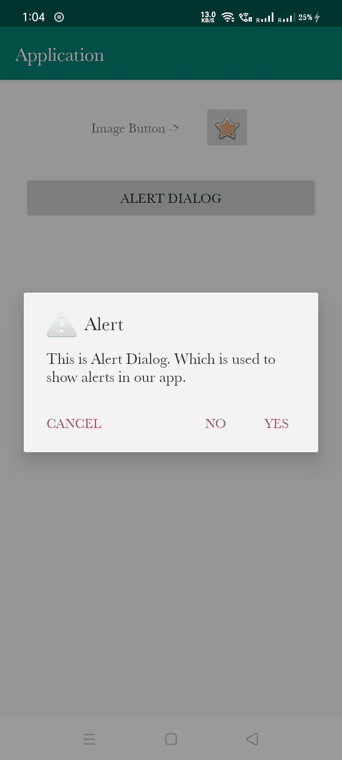
Output
Now once you click on the alert dialog button an AlertDialog will be displayed.
Android Custom Dialog using Kotlin
Now I will show you how to create the AlertDialog with a custom layout. Custom layout means you can create your design as you want.
To create a custom AlertDialog we use the Dialog class. Most of the methods are similar in the custom alert dialog.
val customDialog = Dialog(this)
You need to pass the context inside the constructor. Optionally, you can also pass another parameter, in the alert dialog style.
The form you have selected does not exist.
The form you have selected does not exist.
Create a custom layout file which will be used in the Alert Dialog.
dialog_custom.xml
<?xml version="1.0" encoding="utf-8"?>
<LinearLayout xmlns:android="http://schemas.android.com/apk/res/android"
    android:layout_width="match_parent"
    android:layout_height="match_parent"
    android:orientation="vertical"
    android:padding="10dp">

    <TextView
        android:layout_width="wrap_content"
        android:layout_height="wrap_content"
        android:text="Custom Dialog Title"
        android:textColor="@android:color/black"
        android:textSize="16sp" />

    <TextView
        android:layout_width="wrap_content"
        android:layout_height="wrap_content"
        android:layout_marginTop="10dp"
        android:text="Custom Dialog Content Details. Which you can set your own as per requirement."
        android:textColor="@android:color/darker_gray"
        android:textSize="14sp" />

    <LinearLayout
        android:layout_width="match_parent"
        android:layout_height="wrap_content"
        android:layout_marginTop="10dp"
        android:orientation="horizontal">

        <TextView
            android:id="@+id/tv_submit"
            android:layout_width="0dp"
            android:layout_height="match_parent"
            android:layout_weight="1"
            android:foreground="?attr/selectableItemBackground"
            android:gravity="center"
            android:padding="10dp"
            android:text="SUBMIT"
            android:textColor="@android:color/holo_red_dark"/>

        <TextView
            android:id="@+id/tv_cancel"
            android:layout_width="0dp"
            android:layout_height="match_parent"
            android:layout_weight="1"
            android:foreground="?attr/selectableItemBackground"
            android:gravity="center"
            android:padding="10dp"
            android:text="CANCEL"
            android:textColor="@android:color/black"/>

    </LinearLayout>
</LinearLayout>
Now, as your design for a custom alert dialog is ready we can create a method for showing it in the MainActivity.kt.
A private method for showing the custom alert dialog with respective buttons click events.
    /**
     * Method is used to show the Custom Dialog.
     */
     private fun customDialogFunction() {

        val customDialog = Dialog(this)

        /*Set the screen content from a layout resource.
           The resource will inflate, adding all top-level views to the screen.*/
        customDialog.setContentView(R.layout.dialog_custom)

        customDialog.tv_submit.setOnClickListener(View.OnClickListener {
            Toast.makeText(applicationContext, "clicked submit", Toast.LENGTH_LONG).show()
            customDialog.dismiss() // Dialog will be dismissed
        })

        customDialog.tv_cancel.setOnClickListener(View.OnClickListener {
            Toast.makeText(applicationContext, "clicked cancel", Toast.LENGTH_LONG).show()
            customDialog.dismiss()
        })
        //Start the dialog and display it on screen.
        customDialog.show()
    }
Add a button in your activity_main.xml with the id as btn_custom_dialog.
<Button
        android:id="@+id/btn_custom_dialog"
        android:layout_width="match_parent"
        android:layout_height="wrap_content"
        android:layout_margin="25dp"
        android:text="Custom Dialog" />
Assign a click event to the button to show the custom alert dialog in MainActivity.kt onCreate method.
     /**
      * Here we have handled onClick of Custom Dialog Button.
      */
      btn_custom_dialog.setOnClickListener { view ->

      //Launch Custom Dialog
        customDialogFunction()
      }
Output
When you click on a custom dialog button you will see the custom alert dialog as below.
Android Custom Progress Dialog using Kotlin
A dialog showing a progress indicator and an optional text message or view. Only a text message or a view can be used at the same time.
ProgressDialog is a modal dialog, which prevents the user from interacting with the app. The default ProgressDialog class was deprecated in API level 26.
Now I will show you how to create a custom progress dialog. Generally, the progress dialog is used while doing some background execution or getting the JSON data from the server.
It is similar to a custom alert dialog because here I will show you to create a progress dialog with a custom layout.
Create a custom layout file which will be used in the Custom Progress Dialog.
dialog_custom_progress.xml
<?xml version="1.0" encoding="utf-8"?>
<LinearLayout xmlns:android="http://schemas.android.com/apk/res/android"
    android:layout_width="match_parent"
    android:layout_height="match_parent"
    android:gravity="center"
    android:orientation="horizontal"
    android:padding="10dp">

    <ProgressBar
        android:layout_width="50dp"
        android:layout_height="50dp"
        android:layout_marginEnd="10dp" />

    <TextView
        android:layout_width="wrap_content"
        android:layout_height="wrap_content"
        android:text="Please Wait..."
        android:textColor="@android:color/black"
        android:textSize="16sp" />

</LinearLayout>
Create private method for showing the custom progress dialog in the MainActivity.kt.
    /**
     * Method is used to show the Custom Progress Dialog.
     */
    private fun customProgressDialogFunction() {
        val customProgressDialog = Dialog(this)

        /*Set the screen content from a layout resource.
        The resource will inflate, adding all top-level views to the screen.*/
        customProgressDialog.setContentView(R.layout.dialog_custom_progress)

        //Start the dialog and display it on screen.
        customProgressDialog.show()
    }
Add a button in your activity_main.xml with the id as btn_custom_progress_dialog.
<Button
        android:id="@+id/btn_custom_progress_dialog"
        android:layout_width="match_parent"
        android:layout_height="wrap_content"
        android:layout_margin="25dp"
        android:text="Custom Progress Dialog" />
Assign a click event to the button to show the custom progress dialog in MainActivity.kt onCreate method.
       /**
         * Handled on click of Custom Progress Dialog Button.
         */
        btn_custom_progress_dialog.setOnClickListener { view ->

            //Launch Custom Progress Dialog
            customProgressDialogFunction()
        }
Output
When you click on custom progress dialog button you will see the custom alert dialog shown as below.
The form you have selected does not exist.
The form you have selected does not exist.
Summary
In this article, you learned about Snackbar as well as how to create and show the AlertDialog, Custom AlertDialog, and CustomProgressBar using Kotlin.
[/fusion_text][/fusion_builder_column][/fusion_builder_row][/fusion_builder_container]