


Introduction
There are various instances where you need to either showcase items to the user by allowing them swipe through, introduce app features during setup which is popularly known as on-boarding screen or maybe display different sections in one screen using tabs to set the title while swiping through. ViewPager2 is a better version of the usual viewpager android widget that can be used to achieve these swipe-able behaviors with views and fragments without opening a new activity. In this tutorial we will be building a simple fashion gallery application to demonstrate different ways that you can utilize the features that comes with ViewPager2. These features include
- Using ViewPager2 with RecyclerView.Adapter
- Using ViewPager2 with FragmentStateAdapter
- Using TabLayoutMediator to connect tablayout with viewpager2
- Vertical scrolling with ViewPager2
This is the part 1 of two part post and we will be creating an on boarding screen
Project Setup
Let’s start with the build.gradle, we need to enable viewBinding and add a dot indicator library. The indicator library will make it easier to identify current page.
build.gradle
android{
...
//enable viewBinding
  buildFeatures{
viewBinding true
}

}
dependencies {
//Add a dot indicator library
    implementation ("com.tbuonomo:dotsindicator:4.2")
...
}
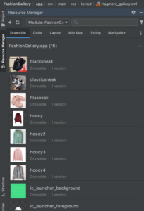
Through the Resource Manager add the images for the slides
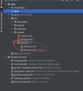
In the themes folder also, open the both theme.xml files and change the style to noActionBar, this will remove the toolBar at the top of the screen
Theme.xml
<resources xmlns:tools="http://schemas.android.com/tools">
    <!-- Base application theme. -->
  <style name="Theme.FashionGallery" parent="Theme.MaterialComponents.DayNight.NoActionBar">
        ...
    </style>
</resources>
Now create a new Empty Activity Project and name it FashionGallery. Add view pager2 to the activity_main.xml.
<androidx.constraintlayout.widget.ConstraintLayout
 xmlns:android="http://schemas.android.com/apk/res/android"
    xmlns:app="http://schemas.android.com/apk/res-auto"
    xmlns:tools="http://schemas.android.com/tools"
    android:layout_width="match_parent"
    android:layout_height="match_parent"
    tools:context=".MainActivity">
<!--Todo 1: Add viewPager2->
   <androidx.viewpager2.widget.ViewPager2
        android:id="@+id/viewPager"
        android:layout_width="match_parent"
        android:layout_height="400dp"
        android:layout_marginTop="16dp"
        app:layout_constraintLeft_toLeftOf="parent"
        app:layout_constraintRight_toRightOf="parent"
        app:layout_constraintTop_toTopOf="parent" />

   <com.tbuonomo.viewpagerdotsindicator.DotsIndicator
        app:layout_constraintStart_toStartOf="parent"
        app:layout_constraintEnd_toEndOf="parent"
        android:layout_marginTop="16dp"
        app:layout_constraintTop_toBottomOf="@+id/viewPager"
        android:id="@+id/dots_indicator"
        android:layout_width="wrap_content"
        android:layout_height="wrap_content"
        app:dotsColor="@android:color/darker_gray"
        app:dotsCornerRadius="8dp"
        app:dotsSize="16dp"
        app:dotsSpacing="4dp"
        app:dotsWidthFactor="2.5"
        app:selectedDotColor="@color/purple_500"
        app:progressMode="true"
        />

    <com.google.android.material.button.MaterialButton
        android:id="@+id/controllerBtn"
        android:layout_width="wrap_content"
        app:layout_constraintTop_toBottomOf="@id/dots_indicator"
        app:layout_constraintStart_toStartOf="@id/dots_indicator"
        android:layout_marginTop="16dp"
        android:text="Next"
        app:layout_constraintEnd_toEndOf="@id/dots_indicator"
        android:layout_height="wrap_content"/>

</androidx.constraintlayout.widget.ConstraintLayout>
In addition to the viewPager2 we also added an indicator widget which is used to show current item been displayed and also a button for moving to the next page.
ViewPager2 Adapters
Just like most widgets that display a list of items, viewpager2 needs an adapter to easily control how each item is displayed on the screen. There are two types of adapters that can be used with viewpager2;
- RecyclerView.Adapter : Just like a recyclerview you can use views with an item layout to build out your slides in viewpager2. If you know how to use a recyclerview then this approach should be familiar to you.
- FragmentStateAdapter : This adapter is built to work well with fragments. This way you can easily integrate viewpager2 with fragments.
ViewPager2 with RecyclerAdapter
Lets start with building the introduction screen with a RecyclerView.Adapter. For every adapter there is a view holder and for every view holder there is an item layout so lets create an item layout for the view holder.
intro_items.xml
<androidx.constraintlayout.widget.ConstraintLayout
xmlns:android="http://schemas.android.com/apk/res/android"
    xmlns:app="http://schemas.android.com/apk/res-auto"
    xmlns:tools="http://schemas.android.com/tools"
    android:layout_width="match_parent"
    android:layout_gravity="center_vertical"
    android:layout_height="match_parent">

    <androidx.appcompat.widget.AppCompatImageView
        android:id="@+id/iconIv"
        android:layout_width="200dp"
        android:layout_height="200dp"
        android:layout_marginTop="32dp"
        app:layout_constraintBottom_toBottomOf="parent"
        app:layout_constraintEnd_toEndOf="parent"
        app:layout_constraintStart_toStartOf="parent"
        app:layout_constraintTop_toTopOf="parent" />

 <androidx.appcompat.widget.AppCompatTextView
        android:id="@+id/titleTv"
        android:layout_width="wrap_content"
        android:layout_height="wrap_content"
        android:layout_marginTop="8dp"
        android:textSize="18sp"
        android:textStyle="bold"
        app:layout_constraintEnd_toEndOf="@id/iconIv"
        app:layout_constraintStart_toStartOf="@id/iconIv"
        app:layout_constraintTop_toBottomOf="@+id/iconIv"
        tools:text="Title" />

    <androidx.appcompat.widget.AppCompatTextView
        android:id="@+id/descTv"
        android:layout_width="wrap_content"
        android:layout_height="wrap_content"
        android:layout_marginTop="8dp"
        android:gravity="center"
        android:text="Description"
        app:layout_constraintEnd_toEndOf="parent"
        app:layout_constraintStart_toStartOf="parent"
        app:layout_constraintTop_toBottomOf="@+id/titleTv" />
</androidx.constraintlayout.widget.ConstraintLayout>
In the item layout we have added an AppCompatImageView to display the image, AppCompatTextView to show the title and another AppCompaTextView to show the description. Unlike a recyclerView which needs a height of wrap content, the height of the parent view group for a viewpager item must be set to match parent else the app will crash and you will get an error.
Lets create a data class for the adapter and list items
data class Intro(val photo:Int,val title:String,val desc:String?)
In the Intro class we have created three variables. the photo variable for the drawable image, title for the title of each page and desc for the description of the page.
Next is to create an adapter for the viewpager2. Create a new class and name it IntroAdapter
IntroAdapter.kt
class IntroAdapter(private val introList: List<Intro>):RecyclerView.Adapter<IntroAdapter.IntroViewHolder>() {

    inner class IntroViewHolder(private val binding:IntroItemBinding):RecyclerView.ViewHolder(binding.root){

        fun bindItem(intro: Intro){
         binding.descTv.text= intro.desc
         binding.titleTv.text= intro.title
         binding.iconIv.setImageResource(intro.photo)

        }
    }


    override fun onCreateViewHolder(parent: ViewGroup, viewType: Int): IntroViewHolder {
        return IntroViewHolder(
            IntroItemBinding.inflate(
                LayoutInflater.from(parent.context),
                parent,
                false
            )
        )
    }

    override fun onBindViewHolder(holder: IntroViewHolder, position: Int) {
        holder.bindItem(introList[position])
    }

    override fun getItemCount(): Int {
      return introList.size
    }
}
In the IntroAdapter
- We have created an inner viewHolder class to bind the intro item layout and then set it to the adapter as its type.
- override the onCreateViewHolder and return the IntroViewHolder inflating the layout in the constructor.
- override the onBindViewItem and call the bindItem method to set an item fro each position
- override the getItemCount and return the size of the list.
Lets create a list for to used by the adapter. Create an object called PagesList
PagesLists.kt
object PageLists {
val introSlides = listOf(
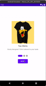
Intro(R.drawable.t_shirt,"Tee-Shirts","Nicely designed T-Shirt tailored to your taste"),
Intro(R.drawable.sneak,"Sneakers","Comfortable and affordable shoe wear to keep you \\n balanced while taking a walk"),
Intro(R.drawable.hoody,"Hoody","Identify with Styles by getting one of the customized \\n hoodies in store")
)
}
Next is to connect the adapter to the viewpager2 in the MainActivity.
class MainActivity : AppCompatActivity() {
    private var binding:ActivityMainBinding? = null
    private var viewPager2:ViewPager2? = null

    private val pager2Callback = object:ViewPager2.OnPageChangeCallback(){

        override fun onPageSelected(position: Int) {
            super.onPageSelected(position)

            if (position == PageLists.introSlides.size -1){
                binding?.controllerBtn?.text = "Finish"
            }else{
                binding?.controllerBtn?.text = "Next"
                binding?.controllerBtn?.setOnClickListener {
                    viewPager2?.currentItem = position+1
                }
            }
        }
    }
    override fun onCreate(savedInstanceState: Bundle?) {
        super.onCreate(savedInstanceState)

        binding = ActivityMainBinding.inflate(layoutInflater)

        setContentView(binding?.root)

        setupViewPager(binding!!)
    }


   private fun setupViewPager(binding: ActivityMainBinding){

        val adapter = IntroAdapter(PageLists.introSlides)
        viewPager2 = binding.viewPager
        viewPager2?.adapter = adapter
        viewPager2?.registerOnPageChangeCallback(pager2Callback)
        binding.dotsIndicator.setViewPager2(viewPager2!!)

    }

    override fun onDestroy() {
        super.onDestroy()
        viewPager2?.unregisterOnPageChangeCallback(pager2Callback)
    }
}
In the MainActivity
- We have created a PagechangeCallback where we are overriding the onPageSelected method. In this method, we check if it’s the last position and set the button text to finish else set the button text to Next. Also, we set the onclickListener to the button when the text reads next to increase the position by 1 which changes the currentItem.
- In setUpViewPager method, the viewPager2 is set to the IntroAdapter passing in the introSlides list to the adapter constructor. Also we register the onPageCallback with the viewpager and as well set the dotsIndicator to it.
- Its also important to un register the onPageCallback when no longer in use that we have done in the onDestroy method.
Now when you run the app here is what you have
In the part 2 of this post you will see how to use ViewPager2 with fragments and FragmentPagerAdapter